Free Shipping for CNC Bit orders over $160

Shop

Shop By Project

Shop By Type

Sets

Sets

Inlay

Inlay

3D Carving

3D Carving

Acrylic

Acrylic

Engraving

Engraving

Bowl And Tray

Bowl And Tray

Digital Files

Digital Files

Sets

Sets

Ball Nose

Ball Nose

Compression

Compression

Downcut

Downcut

Drills

Drills

Engraving

Engraving

Extended Cut

Extended Cut

Roughing

Roughing

Rounding

Rounding

Slotting

Slotting

Straight Cut

Straight Cut

Surfacing

Surfacing

Upcut

Upcut

V Grooving

V Grooving

Jenny Bits

Jenny Bits

Collets

Collets

Accessories

Accessories

CNC Machines

CNC Machines

Vacuum Tables

Vacuum Tables

Spindles

Spindles

Software

Software

Digital Files

Digital Files

Merch

Merch

Closeout

Closeout

CNC Resources

Database Downloads

About

Contact Us

Get A Gift Card

How to Achieve Perfect Raised Lettering Every Time

Thin, intricate raised lines are a beautiful way to create elegant signs with your CNC router, but all too often, those beautifully carved fine lines end up being far too breakable for even handling the finished product, let alone selling it.


The problem in carving raised lettering in thin fonts is their delicacy. When you carve around delicate script using a straight end mill and a basic pocket toolpath, you leave behind narrow strips of wood that don’t have much strength. Those thin details can snap, chip, or tear out before the carve is even finished. And they certainly will after it’s finished. 


There’s no CNC heartbreak like a beautiful sign ruined by brittle lettering. Luckily, all it takes to prevent that destruction is a little bit of toolpath strategy.

Running your CNC router small business lets you create your own future, but doing so requires learning how to troubleshoot challenges like carving delicate fonts.

Why Thin Raised Letters Break

Raised lettering is a fantastic-looking, classic sign-making technique that works beautifully with chunkier fonts with plenty of width and support. But when you switch to elegant script, cursive names, or thin decorative lettering, that support breaks.


A straight bit cuts straight walls. Which has a lot of great applications, but not in carving out intricate lettering. The tool removes the material around the text, and what’s left behind may be so thin that it can’t support itself. A curl in a fancy font becomes a weak point, and a tight connection can fracture between letters. No matter what fine script looks like in the design software, its strength is always going to be subject to how it’s cut.


The tighter and thinner the lettering, the more likely it is to fail with a standard pocketing approach. So if you’ve been hunting for better CNC fonts, keep in mind the font may not be the problem at all. You’re just using the wrong method to cut it.

Raised Script Using a V-carve

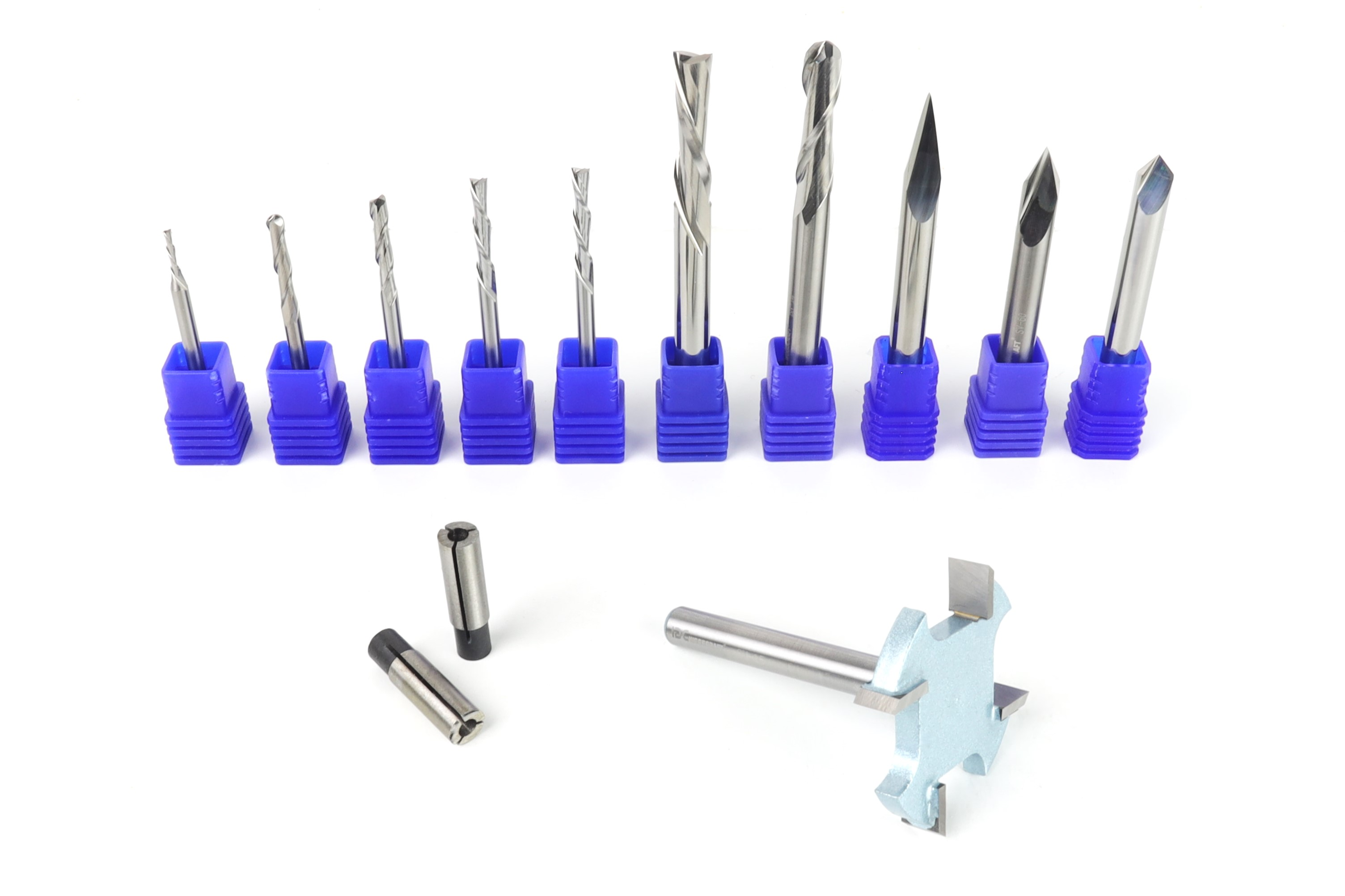
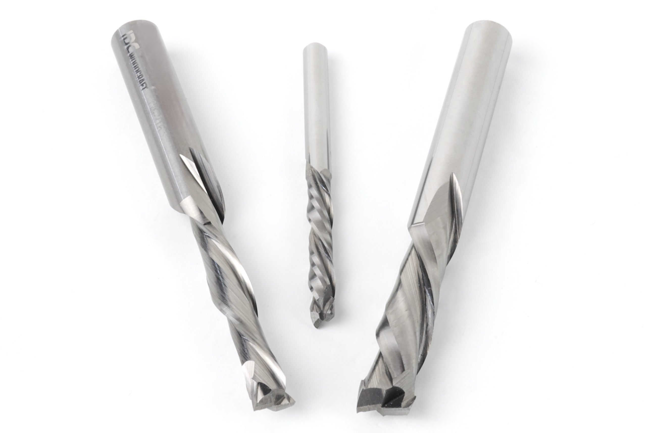
One answer to finicky, elegant letters breaking is to find thicker fonts and avoid anything too detailed. That works, sure, but it’s also a pretty unsatisfying solution. You end up designing around the limitation instead of solving it.


Would you settle for the next best in the real world? Then why settle in CNC, where half the point is being able to make exactly what you, and your customer, wants?


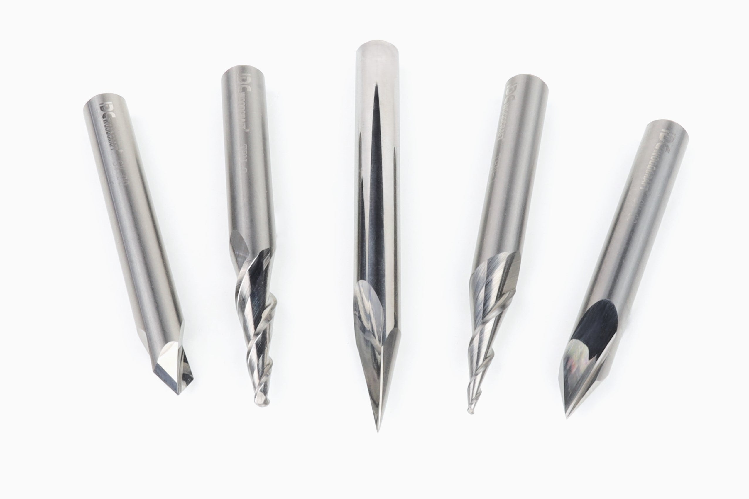
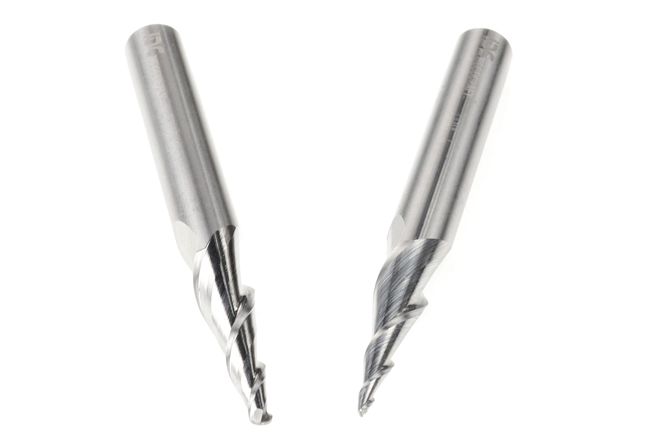
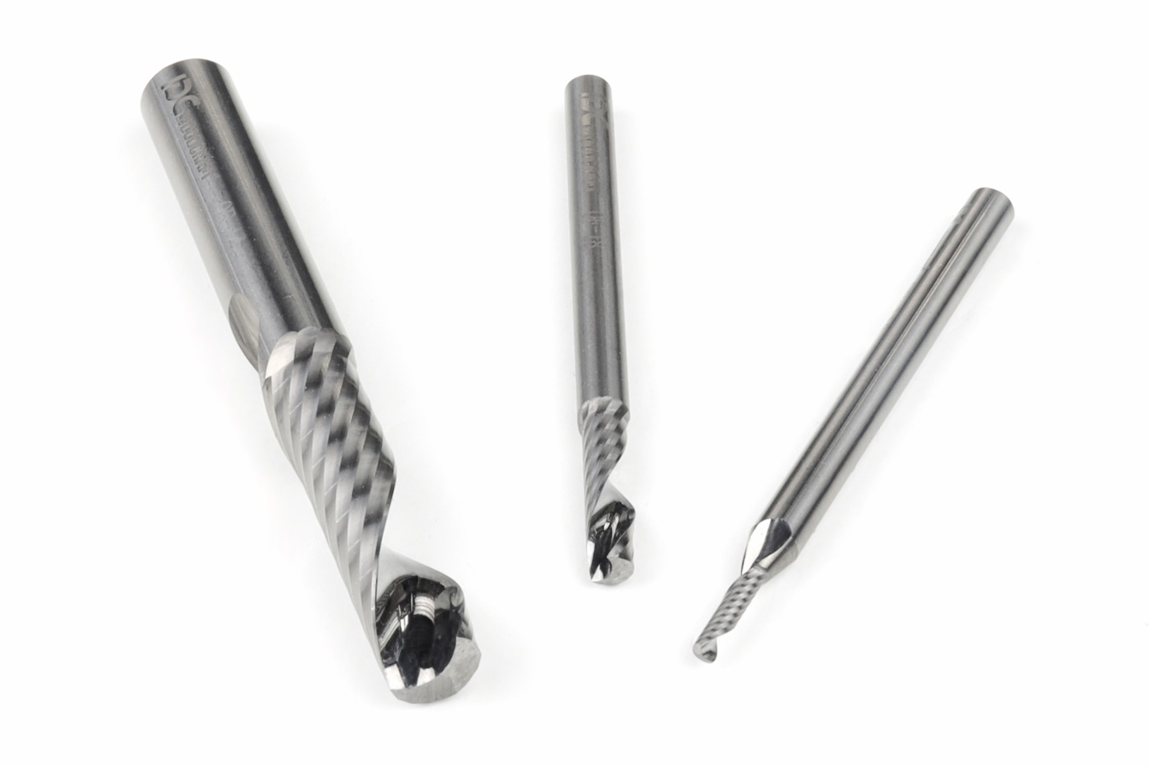
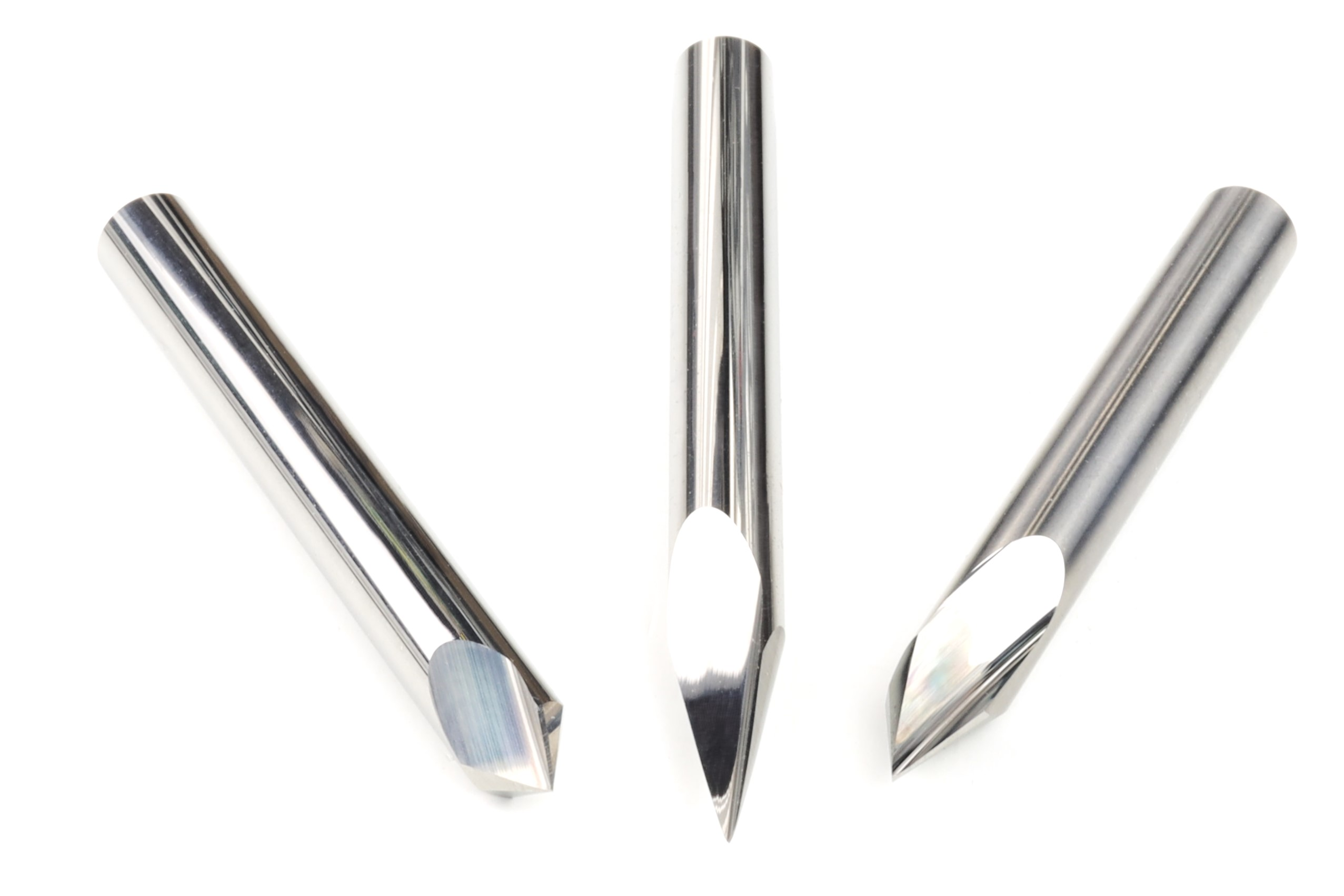
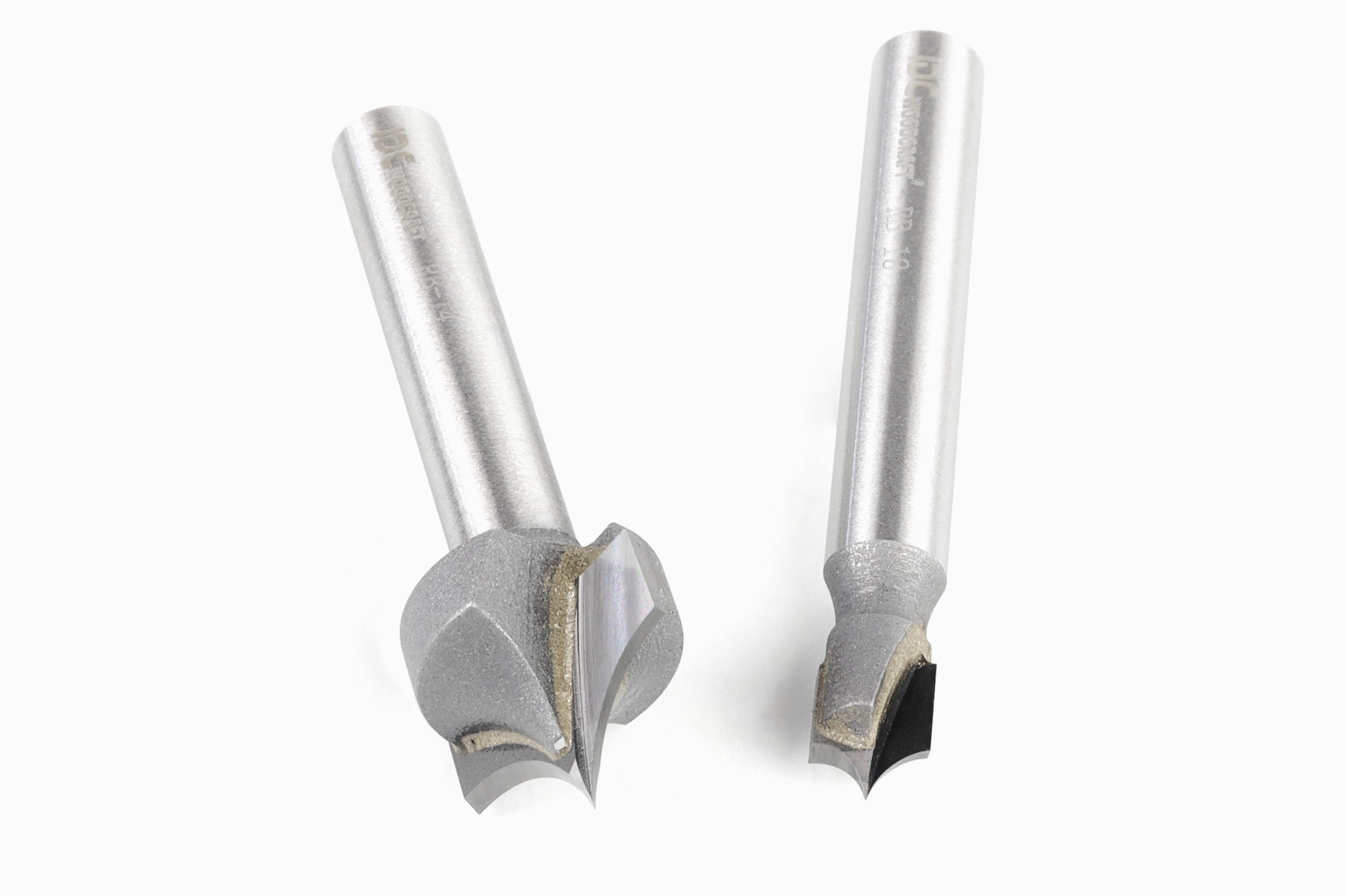
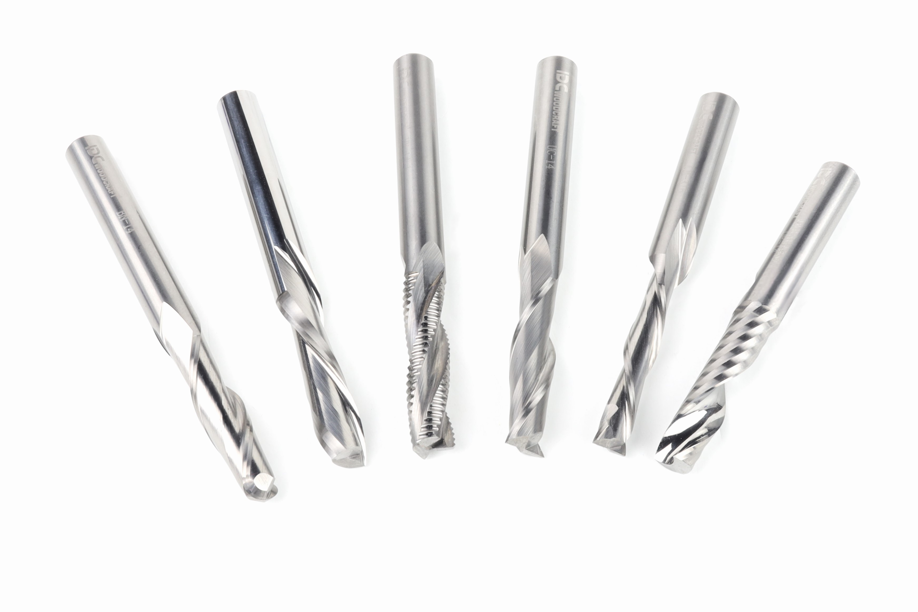
A more effective fix is to stop thinking about the carve as a regular pocket and start thinking about it as a shallow V-carve with controlled depth. When you pocket around raised letters with an end mill, you create vertical walls and leave delicate areas fully exposed. But when you use a V-carve with a flat depth, the shape around the letters changes completely.


Instead of forcing the cutter to make deep, straight cuts around thin details, you create angled relief that supports the lettering better and makes the whole design look cleaner and more refined.


Don’t carve your letters into thin walls, carve them into strong ridges and pyramids.

Why V-carve with Flat Depth

Think about it as if you’re just giving the letters a wider base. A V-bit cuts a sloped channel instead of a straight-walled one. That alone makes a huge difference for fine lettering. The angled sides create a more graceful transition around the raised text, and the carve can preserve details that a standard end mill would either miss or destroy.


Flat depth tells the software to stop the V-bit at a specific depth, rather than letting it plunge as deep as it would based on the width of the open area. You get a clean, crisp V-carving look without cutting too deeply or ruining the design (or changing it in any substantial way).


Most of the time, a shallow flat depth around 0.1 to 0.15 inches is enough to create a sharp, elegant result while keeping the design structurally sound. Then add a clearing tool, typically a small end mill, to efficiently remove the wider areas. The end mill handles the bulk cleanup, and the V-bit comes in where the fine detail matters most. It’s a tag-team setup, and it works beautifully for script, flourishes, and other delicate raised text.

Always Preview Before Carving

It may seem obvious, but always check the digital previews before carving your project. It only costs a few minutes, but carving without previewing can cost you wood stock and a lot more time.

One of the smartest things you can do before you cut anything is study the preview. It will tell you a lot about what’s coming. If you run a pocket toolpath on a thin script font and the preview looks chunky, incomplete, or rounded off in places that should be crisp, that’s a potential issue.


The center of a letter should clear properly, loops can look closed when they should be open, and be sure to inspect the delicate tails on letters. The preview helps you catch any problem before the bit hits the wood.


And if the preview looks rough with a pocket toolpath, switching to a V-carve with flat depth often changes the whole picture. Tight little spaces will open up, the lettering will look more natural, and the carve will have better definition. 


That’s not just better for appearance. It’s better for reliability, readability, and sales.
 

A Few Vectric Tricks

It's possible to make delicate scripts like Edwardian work, but you'll need some tricks from old hands like Garrett to carve them to be sturdy. Scroll down to see his video guiding you through the process.

This entire post is about changing your font strategy instead of changing your actual font, yes, but the problem might not even be the font. We stand by the V-carve/flat depth method, but sometimes the issue isn’t even the carving method. Sometimes the vectors themselves are the troublemakers.
 

If your lettering overlaps or script characters cross into each other, your software may throw errors or produce weird results in the toolpath preview. That happens a lot with script fonts because letters connect, loop over one another, or create intersections that confuse the toolpath.
 

It is especially true if you use a font with flourishes like Garrett did in his example with Edwardian Script.
 

Alt image

In Vectric, one of the quickest fixes is to use the weld feature to merge overlapping vectors into a clean, unified shape. That eliminates the intersections that cause toolpath problems and makes the design machine-ready. After that, running Vector Validator can help confirm that the geometry is clean and free of issues that cause poor cuts or missing details. Clean vectors mean cleaner toolpaths, fewer surprises, and a much smoother trip from design to finished sign.
 

Another helpful trick is to properly center your design before generating toolpaths. It sounds basic, and it is, but it’s amazing how often a quick alignment fix saves headaches later. A clean layout, validated vectors, and the right toolpath strategy make a world of difference.